Transportation Data Tools #4: Location Affordability Index

Since transportation is so intertwined with other aspects of urban life – housing, land use, and technology, for example – it is only fitting that we should look beyond purely transportation agencies for useful data. Enter the Location Affordability Index, a dataset developed by the Department of Housing and Urban Development (HUD) that combines transportation and housing costs to show a more holistic picture of the cost of living across the United States.

Photo by Angelo Pantazis on Unsplash

People may live further from their jobs to shave some dollars off their mortgages, but do not factor in the increased commuting costs they will incur as a result. Or they may choose to live somewhere with better public transit access but wonder if the higher rent justifies the lower gas bill. For transportation professionals, it can be useful to understand on a region-wide scale how housing and transportation costs interact because our projects may raise or lower some of those costs and may affect different populations differently.

There are a few ways to interact with this dataset. To instantly visualize it for your city, this online ArcGIS map plots it at the census tract level. Here is that map for Chicago:

Location Affordability Index by dianaclavery_uo on ArcGIS Online. Darker shades mean less affordable.

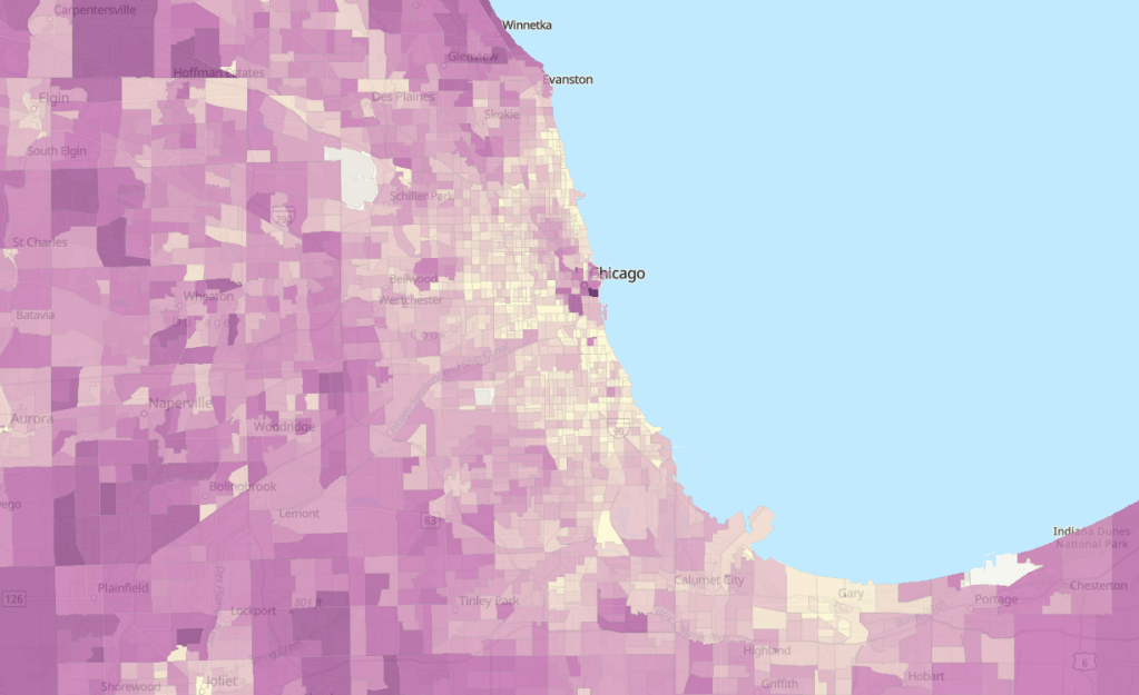
The results are striking, with many of the most dense urban areas with high housing costs ranking lowest in the LAI (shown in lighter shades). This partly because it takes into account the average wages in that area, which tend to be higher in more expensive cities. And, again, it also factors in transportation costs, which benefit from public transit access and lower rates of vehicle ownership common in denser areas.

However, the overview map misses some of the nuance that makes this dataset stand out. For one, HUD analyzed not just median costs but created eight family type profiles for households of different incomes and family sizes and evaluated how costs varied for each family type in each census tract. It makes it clear that transportation investments, higher wages, and housing availability do not benefit everybody equally, which planners are wise to keep at front of mind. This Story Map, a scroll-through narrative, provides more context on how the LAI was developed and allows for side-by-side comparisons of cities, neighborhoods, and family types, as shown here for Atlanta.

ArcGIS Story Map by Diana Lavery. Darker shades mean less affordable.

Lastly, the raw data itself is available on HUD’s eGIS Storefront. If housing and land use are up your alley, you’ll find lots more on this site to peak your interest.

I appreciate the obvious care and thought that went into developing this very detailed and nuanced dataset, and hope it can contribute to a greater awareness of how housing and transportation affect each other.

Transportation Data Tools #3: Open Data Portals

I’ve mentioned it briefly before, but the open data tools offered by some local governments these days really are quite impressive. It’s a win-win situation: you get access to interesting data to explore, and cities might benefit if you develop an app or something useful to your fellow residents. Search for your own city here or have fun exploring some other cities’ open data systems. Here are a few worth highlighting:

Cincinnati

Photo by Jordan on Unsplash

Ohio may not get much love from urbanist types like me, but it was on my mind because I just visited for the first time to see my husband’s hometown. While Cincy’s open data portal is not as well organized and searchable as some bigger cities, it has a lot of information if you know where to look. One that caught my eye is called PDI (Police Data Initiative) Pedestrian Stops. Police-pedestrian interaction is often overlooked by transportation planners but is so important, because we can’t get people out of cars if they don’t feel safe walking through their neighborhood without getting stopped and frisked.

The city provides an attractive dashboard to explore this dataset (click the image to open in a new window). You can also do your own analysis by accessing the raw data through the API or by downloading a CSV.

Cincinatti’s Pedestrian Stops dashboard.

New York City

I’ll admit I’m a little partial to Gotham, having spent three memorable years there, but I know some see it as a little overrated. Still, their open data system stands out. New York City has robust spatial and tabular data on everything from taxi and limo driver registrations, pedestrian counts, and vehicle counts to the location of subway entrances and parking meters. And that’s just the transportation section! It would be interesting to pair one of the latter with data on crash rates in the neighborhood, for example, or demographics, to look for correlations. Most of the data can be exported into a shapefile for GIS analysis or into Excel. If you don’t have access to GIS, you can also export to a KMZ file and view it in Google MyMaps.

The New York City Open Data Portal

Ghana

Photo by Yoel Winkler on Unsplash

Add a pretty good open data initiative to this West African country’s list of assets, which already includes extraordinarily friendly people, fascinating history, and beaches with free-roaming wild boars. Their transport data focuses mostly on road fatalities, which sadly cause a disproportionate number of deaths in low- and middle-income countries. The data is quite detailed and tabulates by demographic, region, and road type, among other factors. As with the other cities, there’s lots here on finance, health, and development too, if that is more your style.

Ghana’s Open Data Initiative.

I hope that sparks your interest enough to go out and start exploring this open data yourself. Let me know what you find!

Transportation Data Tools #2: Public Use Microdata Samples

For most things, the Census and American Community Survey (ACS) only offer data at the aggregate level: by census block group or city, for example. You can view how many people in a city live under the poverty level or what percentage of people in a tract own their homes, but you have to use their prepopulated table formats available on data.census.gov.

If you’re willing to forego analyzing at small geographic levels, though, the ACS gives you more freedom with microdata: raw sample data at the person level. You can view what time people leave for work and how they get there. You can also view variables that the Census doesn’t make available at the aggregate level, like place of work. Because the data is stored at the single record level, you can do endless crosstabs, creating the exact tables you want, getting more detailed than regular Census data allows. This has amazing implications for transportation planning, especially for understanding commuters’ origins and destinations. It’s not enough to know that a bunch of people work in Bellevue; we want to know where they are coming from. That is where microdata is handy.

Some examples of transportation variables available at http://www.ipums.org.

The catch is that to protect privacy you can’t see the block group or even census tract where these individuals are coming from or going to; instead, locations are grouped into Public Use Microdata Areas, or PUMAs. These are generally larger than census tracts but not much larger than small cities; they are required to contain at least 100,000 people. Still, this data can be very useful.

A site I like to use for microdata is IPUMS, which makes it available in formats that statistical software can read. If you want an Excel export, use the Census website. Using microdata samples, I was able to look at what time people living in our commuter rail corridor were leaving for work, comparing by race and income level. By matching this against when the train actually operates, we can see how well the train’s limited hours are serving different populations in the region.

Any data collected by the ACS is available in microdata, from whether a house has flush toilets to whether someone has a cognitive disability. Lots of researchers beyond transportation planning will find this useful.

If you’ve used this for your own work, I’d love to hear about it!