Finding a Good Data Set to Play With

The best way to really learn data analytics is to apply what you’ve learned in classes and videos to process and analyze real, messy, complicated data. You may be lucky and have the resources and time to do this all at work. If not, you’ll likely be doing side projects in your spare time to build skills. You’ll have to start with finding a data set.

A good dataset is one that pertains to a topic that interests you, has enough observations (rows) to allow you to find patterns, and enough variables (columns) to give you practice deciding what’s important or what’s not.

I recommend starting with a question you have about the world, and then looking for data to help you answer that question. This will motivate you to keep going when it’s tough, and give you an end result you’re proud to share with the world. So where do you start? Here are some transportation-related data sources to consider.

Metropolitan Planning Organizations

Photo by Connor Wang on Unsplash

Metropolitan planning organizations (MPOs) are regional planning bodies that administer federal grants for their region. Every metro area in the United States is required to have one, and they often publish great data. A data source that I’m fond of locally is our Puget Sound Regional Council’s Household Travel Survey, a survey of the travel habits of households in the region. They ask participants to log every trip they take for a week and also ask attitudinal questions such as how one feels about autonomous vehicles. In survey data, you are almost guaranteed to find missing data, but dealing with it is a skill you will always need, so better get to practicing. Find your local MPO here and see what data they can offer you.

Open Data Portals

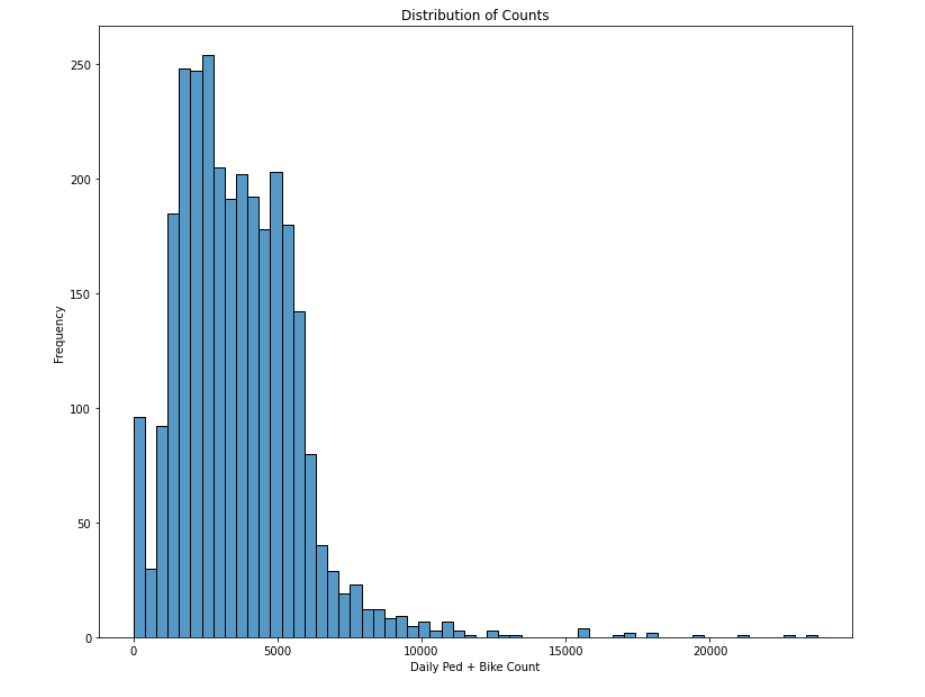
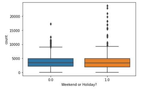
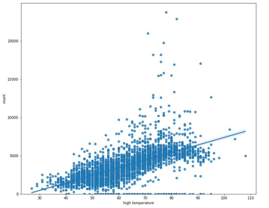
I’ve written before about Open Data Portals that nearly every government seems to provide these days. From the transportation side, these can provide data on traffic or freight volumes, pedestrian and bike counts, or transit usage. They have the benefit of being fairly complete because they are collected passively, though I’ve seen device malfunctions create missing data in some instances. In addition to transportation, you can often find data about housing, criminal justice, and education. A lot of these will be time-series data, and working with that is also a good skill to develop.

Flight Radar24

Credit: FlightRadar24

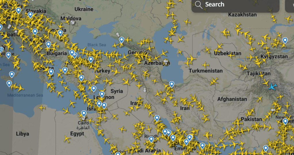
For a different mode of transportation, think about all the data produced by the thousands of flights taken around the world each day. A fellow student in my statistics program recommended FlightRadar24 as a source of data on airplanes, flights, and airports, including real-time locations as shown above.

American Community Survey

The ACS, a yearly survey by the US Census Bureau, asks several commute-related questions, such as what time respondents leave for work and what mode of transportation they use to get there. This data has already been processed and cleaned, missing data is minimal, and you’ll get practice learning how to deal with census tracts or other geographic units. Unfortunately, all this processing takes time and by the time you see it it’s usually 1-2 years old or more (as of writing, the most recent ACS data available is from 2019). Also, due to tightening privacy restrictions, data is less detailed than it once was and there are fewer data sets available at the individual respondent level.

Kaggle

Credit: Kaggle

Kaggle is perhaps the best-known website for crowd-sourced datasets and also a robust data science community. Spanning a variety of topics, these datasets are available to anyone with a free account and are easily searchable. I will say that some of these – The Titanic, home prices, and any covid-related dataset – have been used quite a bit, so consider something a bit more novel if you are hoping to publish your results somewhere like medium.com. These data sets may also have fewer guarantees of quality or accuracy, because anyone can contribute. Nonetheless, there is a lot here to explore. Kaggle also hosts data competitions for entry-mid level data scientists and folks still learning.

I hope this inspires you to get out there and find a data set you’ll enjoy playing with. What data sources do you use when exploring and learning?

How To Avoid Park-Goers In a Pandemic

Or, if you’re just anti-social

When the pandemic started and everything was upended, I was curious how it was affecting people’s use of city parks. Anecdotally, I knew I was using them more than usual, because there wasn’t much else to do, and I still needed to exercise. It seemed like other people were too. I gathered data from a pedestrian and bicycle counter in Myrtle Edwards Park at the Seattle DOT’s website, and went to work (read more about the wonders of open data at my post here). Below is a no-code summary of what I found; you can view the whole Jupyter notebook of my Python code here.

First I did some basic apples-to-apples comparison of weekday activity in April 2020 compared to Aprils in past years.

April 2020 was nothing special.

What I found was nothing dramatic. April 2020 saw parks getting more usage than in most previous years, but less than in 2019. Perhaps covid had an impact, but perhaps population growth counteracted it. April 2020 was also unseasonably sunny, and in Seattle that really seems to bring people outside as well. I decided to try to determine what best accounted for those differences.

In addition to park usage data, added weather data from NOAA to my toolbox. As a side note: both the counter and the weather data were accessed via APIs. APIs allow you to access a continuous stream of data that updates every time you run your code, rather than having to download and import a new spreadsheet, for example. Here’s a decent explanation of APIs. This was helpful because I planned to incorporate new data as the pandemic unfolded.

Next, it was time to explore the distribution of the pedestrian and bike count data. This is an important step because many statistical analyses assume that the data is distributed somewhat normally; that is, a bell curve.

I noticed here that there were some extreme outliers. After some head-scratching, I figured out the dates coincided with the annual Hempfest event that happens at that park and brings thousands of marijuana lovers to the shores of Elliott Bay in a haze-filled celebration. I decided to mark those days, since they’re so anomalous, so I could account for them if I wanted to. Other than that, the data looked normal enough to me.

Yeah, that’s enough people to throw off my model. Photo: Seattle Hempfest

Using weather data, I added variables to the dataset for the high temperature of the day and whether it rained that day. I also added variables for whether the day was a weekend or holiday, and whether it occurred between March 2020 and June 2021, when vaccines became widely available.

One surprise was that being a weekend or holiday didn’t seem to make much of a difference at all, except for some outliers.

Weekends and holidays had little effect on park usage.

If weekends and holidays saw higher crowds at parks, we’d expect the orange box to be higher than the blue box, but really, they look very similar.

On the other hand, there is some difference in crowds during the pandemic, as we can see here where the orange box is higher than the blue box, but not by a wide margin.

The pandemic had a slight effect.

Now I start trying to make a model that explains what accounts for differences in crowds. Here’s a scatterplot with daily high temperature and count, and a first attempt at linear regression:

This model is ok, except for outliers, and temperatures above about 87 degrees. It makes sense – Seattleites start to get real hot and bothered after that point, and keep to the shade or the air-conditioned mall.

I played around with different models that accounted for different variables. Ultimately, the best model I found included these variables: high temperature, whether it rained that day, amount of precipitation, and whether it was a Hempfest day. The variables of whether it was during the pandemic or a weekend/holiday did not affect the model’s ability to predict park usage, so I left them out. The r-squared with this model was .56, which means that 56% of the variation in park usage can be explained by those four variables. The remaining 44% is due to variables I haven’t yet considered, and probably some random chance.

So there you have it, for now. If you want to social distance and/or generally avoid other people, go when it’s either cold-ish or very hot, raining or planning to rain, and definitely not during Hempfest, which happens in August.

Apparently rain still matters to us. Photo: Jingjie wong on Unsplash

When I get a chance, I’d like to expand on this analysis and look at interactions – such as if the temperature matters more or less when it’s supposed to rain, or if the pandemic made weekends more or less influential in park usage. For now, I’m just glad that I no longer feel the need to plan my life around social distancing, but have a few ideas on how to do it if I ever want to again.

How to Create Surveys that People Will Enjoy Taking, Part 2

Today I’ll focus on writing good questions. While this may seem like the main substance of survey creation, figuring out what and why you’re researching in the first place, from Part 1, should come first.

1. Write questions in a way that reduces bias.

Asking a question like “Do you enjoy using our services?” tends to lead to acquiescence bias: people are generally agreeable, so they’ll give more positive responses because you phrased the question in a positive way. But that’s not going to give you the actionable data you’re looking for.

Instead, you could do a little formatting and rephrase it this way:

“Please select the option that best matches how you feel [with options displayed in a straight line]:
(1) I don’t enjoy using these services (2) (3) I feel neutral about these services (4) (5) I enjoy using these services.”

Putting all options out there makes people feel like it’s ok to give a neutral or negative response, and if you’re surveying for the right reasons, you’ll want that information to help identify areas for improvement.

Little things like this can make a big difference in the quality of responses you get.

Photo: Kelly Dunn

2. Avoid leading questions.

Another form of bias is giving people information that might influence their opinions right before asking them a question. This happens in fundraising and political polling all the time.

Instead of:

“Last year our employee group hosted 12 professional development events. How satisfied are you with our employee group’s work in the last year?”


Just leave out the first part or ask their opinion before presenting this information:

“How satisfied are you with our employee group’s work in the last year?”

If you really want to get useful information from your survey, then don’t try to trick respondents into answering a certain way.

Photo by Hans Vivek on Unsplash

3. Be specific.

People interpret vague questions in different ways, making the results less meaningful.

Consider how you might interpret the question:
How often do you accomplish your errands by walking or using a wheelchair?”
– Frequently
– Sometimes
– Rarely
– Never

You might interpret “frequently” as “every day,” or you might interpret it as “every time I run an errand,” which might only be once a week. Others might think that once a month counts as frequently, compared to how often they walk otherwise.

These types of options can be useful in certain contexts, but generally speaking it will make it hard to interpret your survey results. Use more specific language such as “every time I do an errand” or “about half the time I do an errand” instead if you want to be sure that everyone is interpreting the answer choices similarly. Or use “about once a week” or “2-4 times per week” if you want comparable results regardless of how often the respondent runs errands at all.

Next week: How to ensure you hear from the right people.

Photo: Tyler Nix on Unsplash