Gender and Salary Negotiation: Reflections on My First Datathon

I recently participated in my first datathon along with two coworkers. A datathon is a competition where teams of participants gather and analyze data in order to solve (or at least chip away at) a real-world problem. It was a worthwhile experience that I recommend to others wanting to hone your data chops!

My datathon was through Women in Data and focused on women’s equality in the workplace. My team asked the question: What role does salary negotiation play in the gender pay gap?

Because we couldn’t find any dataset on salaries and negotiation, we created our own with a survey. Respondents reported about a recent job offer they received: the amount the employer offered, the amount they the candidate counter-offered, and the amount of the final offer from the employer.

We pushed the survey out through our networks and various Reddit pages, lacking the funds or time to get a random sample. This type of data collection is known as a convenience sample and is not statistically rigorous, so it’s important to note that the results we collected are true for our sample only and cannot be generalized to the whole population. Our 175 respondents were 49% white women, 24% women of color, 24% men, and 4% non-binary. In order to preserve reasonable sample sizes for each group, we don’t disaggregate any further in our analysis.

With that caveat out of the way, here are some highlights from our research:

Women Didn’t Negotiate as Often or as Hard

The women in our sample did not attempt to negotiate as often as men did, and did not negotiate as aggressively when they did. This graph shows the amount that each candidate attempted to negotiate as a percentage over the employer’s original offer. The tallest column shows that over 40% of white women and women of color did not counter-offer at all (at least not for salary – we did not ask about non-salary benefits).

As the chart suggests, men on average asked for the highest increase when counter-offering:

Group of RespondentsAverage counter-offer
over the employer’s original
offer
Women of color10.5%
White women6.5%
Men14%
Non-binary*5%
N=7 for non-binary respondents who answered this question; due to a low sample size, non-binary respondents are included in the table but not the chart.

But when women did negotiate, they were about as likely as men to get what they asked for.

Though women didn’t negotiate as much, when they did, employers were about just as likely to give them what they asked for as they were for men. This graph shows how likely men, white women, and women of color were to get what they asked for when negotiating.

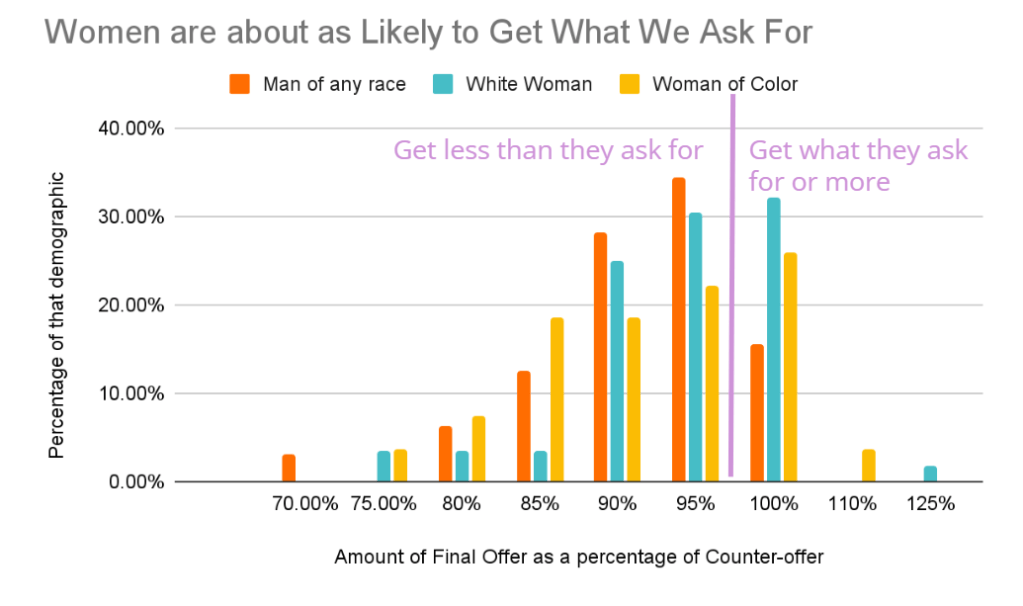
Averages of this data are shown below. 100% would mean the candidates got everything they asked for.

Group of RespondentsAverage final
offer as
percentage of
counter-offer
Women of Color95%
White Women98%
Men95%
Non-binary*95%
Overall96%
N=2 for nonbinary respondents who negotiated.

Of course, keep in mind that women are asking for less, so it’s easier to get what they ask for. Would they get more if they asked for more? There’s only one way to know!

Posted salary ranges discouraged negotiating… but only among women

Women who did negotiate were more influenced than men by whether the job posting included a salary range. When one was posted, women who did negotiate, asked for less money compared to when a range was not posted. The presence of a salary range has little effect on men, however. Perhaps if women were offered close to the top of the range, they felt that there was no sense in negotiating.

Average amount counter-offered over the original offer among women and men who negotiated.

So What?

We hope our datathon work adds a little to the conversation on pay equity. Some takeaways for candidates are:

  • Negotiate, even if a salary range is posted.
  • Know that it’s normal to not get all that you ask for, and that’s ok.

And for employers: it would be great to collect data on what you are giving candidates compared to what they ask for, and whether this varies by gender and race.

Opportunities for more research

To keep our survey short and simple, there’s a lot we couldn’t ask about. If you’re interested in this topic, here are some questions you might consider:

  • The role of negotiating non-salary benefits, like time off or flexibility.
  • More granular differences among women of different races, non-binary, and transgender candidates.
  • The influence of being required to state your desired salary when applying for the job.
  • Differences among different industries and geographic areas
  • A good dataset to look at for salary data (though not negotiation), is the Ask a Manager Salary Survey. Be sure to Take the survey yourself first.

Thanks to my teammates, Cassie Schmitt and Han Song, and to the people who took or promoted our survey!

Car Keys or Bike Helmet?

Decision trees and why it’s so hard to predict non-car trips, or any rare event.

Introduction

This analysis dives into some key transportation habits of residents of the Seattle/Puget Sound region. I particularly look at mode choice: what type of transportation (car, transit, bike, etc.) people use to take a given trip. As a transportation planner by training, I’m interested in how we can get more people out of private cars and onto healthier, more sustainable forms of transportation by improving infrastructure. And as someone who hasn’t owned a car in 12 years, I have a personal interest in improving car-free modes of transport.

I used the Household Travel Survey, a 2021 data set produced by the Puget Sound Regional Council from a week-long survey of 6,000 households and 125,000 trips in the region. Household travel surveys are common ways to learn more about travel behavior and are conducted by agencies across the United States.

I did this analysis in R, and you can view the code on Github. Here I’ll summarize the results.

What determines mode choice for a given trip?

Transportation planners are interested in getting people out of cars, which cause traffic and pollution, and encouraging more sustainable forms of transportation such as transit, walking, and biking. To do this, it’s helpful to first understand how people are traveling now as well as how they decide which mode to use for a given trip.

Disappointingly for me (but not surprisingly), three quarters of the trips in the travel survey dataset are taken by car, with a smaller number by transit, biking, and walking:

BikeCarTransitWalk/
Wheelchair
Other
1.3%76.7%3.8%17.3%0.9%
Travel mode used for all trips reported in the survey.

My goal is to see how well the metrics collected in this survey can predict mode choice for any given trip.

Photo by Viviana Rishe on Unsplash

First Try: Decision Tree

To start, I used a tool called a decision tree to model how different factors determine how somebody chooses to travel for a given trip. You can think of a decision tree like a flow chart, but the output gives likelihoods of certain outcomes. For example, if I had to come up with a decision tree of the top of my head for what influences mode choice, I might come up with something like this:

Chart created by author at http://www.miro.com

In reality, R builds its own version of this for me by looking at all the variables I give it and determining mathematically which model fits my data. In fact, it does this many, many times using a tool called random forest, which is really a whole bunch of decision trees averaged out to improve accuracy. Each individual tree is too complex to reproduce here, so I focus on the results.

To build the random forest model, I gave it these inputs:

Person-Level Variables

  • Age
  • Gender
  • Education level
  • Income
  • Whether they get free transit benefits from work
  • Whether they have a driver’s license
  • Number of vehicles they own
  • Where they live

Trip-Level Variables

  • Purpose
  • Distance
  • Number of people traveling together
  • Origin area

And here’s how well the random forest did at predicting mode choice by trip. The columns are the predicted mode, and the rows are the mode that was actually used. Thus the percentages in each row tell us what percentage of trips that were actually taken in that mode got predicted correctly. Ideally, every number would fall in the diagonal, in bold green, which shows the number of trips where the prediction was correct.

BikeDriveOtherTransitWalkTotal trips
actually taken

# (% correct)
Bike3523907575424 (8%)
Drive218,7221632197720,038 (93%)
Other02574810186492 (10%)
Transit111241116842973117 (54%)
Walk31262621360267510 (80%)
Total trips
predicted
41216048123947461
This table, called a confusion matrix, shows how well our predictions fared against reality.

If you look at just the Drive row, it appears to be not too bad. Out of 20,038 actual trips taken by car, the random forest correctly predicted 18,722 of them (93%) using the model I created. But if you read across the rows for other modes, you’ll see they tell a very different story. Only 8% of bike trips were predicted correctly, and 54% of transit trips. In all these cases, the model predicted that more people drove than actually did. Any model can be good at predicting driving if it just assumes that everyone drives, just as a doctor could be sure to never miss a cancer patient by telling everyone they have cancer. But it’s only truly a useful model if it is also good at predicting who doesn’t drive.

Photo by Evgeny Tchebotarev on Unsplash

By this standard, the random forest I created with these inputs didn’t do a great job at predicting mode choice. One reason is because the data is highly unbalanced – most trips in the sample are taken by car, regardless of the characteristics of the person or trip. While it is therefore easy to correctly predict that a trip was taken by car, it is not easy to catch the few instances where another mode is used because other modes besides walking are rare. Predicting rare events is a famously hard thing in predictive modeling. This is a challenge faced by those who build models to decide if a credit card transaction is fraud or to diagnose a rare disease.

Trying Again: Undersampling

Once I realized the data was unbalanced, I tried again with a different approach. Since part of what makes this hard is that there is too much data on driving compared to other modes, but I have plenty of data anyway, why not remove some of those drive trips from the model so the data is a little more balanced? This is known as undersampling, and is one way to deal with the problem of rare events.

I took a new sample of the dataset, this time one that was 50% drive trips and 50% trips from all other modes. This should help with predicting transit and walking trips, though “other” and bike trips might still be underrepresented.

Here’s how we did with the new model:

BikeDriveOtherTransitWalkTotal trips
actually taken

# (% correct)
Bike5518418877405 (14%)
Drive410,3481733786811,564 (89%)
Other121248118105484 (10%)
Transit28451619543403157 (62%)
Walk3771623464607474 (86%)
Total trips
predicted
65123607827317850
Confusion matrix after undersampling drive data.

This table shows some modest improvements for non-drive modes. This time we got 62% of transit trips correctly predicted (up from 54%), and 14% of bike trips (up from 8%) and 86% of walk trips (up from 80%). Still, those numbers are not as high as we’d like to see and, as I expected, they are worst for the modes that are still rare even after a bit of rebalancing. We also got slightly worse at predicting drive trips.

Conclusion

I started this post hoping it was going to be about a cool model that I wrote to predict travel habits. Instead, I’m writing about how it didn’t go as well as I’d hoped. Why am I sharing this? Because sharing challenges is a great way to learn from each other, and sharing models that aren’t perfect is an important part of data integrity. If I only reported the strongest models, I leave out the inconvenient fact that sometimes variables are not as related as we would like them to be, or give the impression that a relationship is more significant than it really is.

Rebalancing the sample helped us more accurately predict walking trips, since there were still a lot of those, but the model is still lacking at predicting bike and other trips, since those are still such a small fraction of the trips in the sample.

Another reason that our predictions are still off here is the variables I chose can only go so far in determining a person’s choice of mode for any given trip. The data I have doesn’t tell us if the destination has free parking, what kind of bike infrastructure is in the neighborhood, the quality of transit service, how much of a hurry the person is in, and how rainy it is that day. It’s also really hard with this data to measure how much choice the person really has in the matter of how they get around, or if driving is simply their default because nothing else is feasible in their neighborhood. I also don’t really know what the “Other” category refers to, and those trips may have little in common with each other, making prediction hard.

Photo by Clay LeConey on Unsplash

This analysis did not revolutionize my understanding of how people choose their trave mode, but it helped me gain an appreciation for the complexity of that choice. More data on non-car trips and focused research in this area could help planners to better understand what it will take to get people out of their cars.

For those smarter than me on this topic, what else would you try here?

Read more about undersampling with this helpful article at Analytics Vidhya, which informed some of this analysis.

Don’t miss a post!

Who’s Afraid of Autonomous Vehicles?

A cluster analysis suggests: actually a lot of us

How do people feel about autonomous vehicles (self-driving cars), really? Is everyone as vehemently opposed or totally gung ho as they seem? Are you the only one who hasn’t yet made up your mind? With new technologies, like many things, it can be hard to appreciate the nuance and broad range of feelings that people have.

Photo by Gabe Pierce on Unsplash

To help answer this question, I analyzed data from the Puget Sound Regional Council’s Household Travel Survey (2019) about residents’ attitudes toward this impending technological shift. I then used a technique called clustering to identify different types of people based on the answers they gave to survey questions about AVs. Was everyone at one extreme or the other, or would I find nuance?

In this post, I’ll explain how I went about this analysis. As always, this is a summary but my full R code is on my Github.

The Data

My data are comprised of ten questions assessing survey respondents’ interest in and concern about AVs. These include questions like:

  • How interested are you in riding in an autonomous taxi, with no driver present?
  • How interested are you in riding in an autonomous taxi, with a backup driver present?
  • How concerned are you about the equipment and safety of AVs?
  • How concerned are you about the performance of AVs in poor weather?

To prep the data, I removed blank values and converted worded answers to a numeric, ordinal scale to make them easier to analyze.

Clustering

With the data prepared, I turned to clustering. Clustering is a mathematical technique that works like this: I feed the computer all the data we have from the survey about AVs. It looks for groups of observations that have more in common with each other than with others, by measuring distances between pairs of points. These would be people who have similar attitudes about AVs. (See a great in-depth explanation on clustering here at Analytics Vidhya).

It’s easiest to understand if we start by only considering two survey questions (variables). For example, if the two variables were interest in owning an AV and concern about AV safety, we might expect the data to look something like this:

It is easy to visually pick out three clusters from this data, which I do below: people with little interest and a lot of concern (red), people with high interest and not much concern (green), and people who are a little bit of both (blue). And if that approach seems a little loosey-goosey to you, you could take a more scientific approach by measuring how close together the points are in one cluster and how far they are from points in other clusters to convince yourself that these clusters make sense.

Now when you add a third, fourth, or fifth variable, it’s harder to visualize on a graph like this in just two dimensions. Even so, using the clustering technique we can identify some clusters of respondents that belong together, because the math still works.

Here’s a snippet of how I implemented the clustering technique in R, if you’re so inclined:

data1_dist = dist(av_data, method='euclidian') #calculates distances between each pair of points. Only works with numeric data.
clusters = hclust(data1_dist)
plot(clusters) #visualizes the hierarchical cluster structure and helps us decide how many clusters to use.
av_data$cluster = cutree(clusters, 4) # creates four clusters and assigns them to a new variable in the av_data dataset.
view raw AV Cluster hosted with ❤ by GitHub

Results and Conclusion

I told the clustering algorithm to find the four clusters of people that had the most in common with each other in terms of attitudes about AVs. I looked at the characteristics of each cluster it came up with and came up with nicknames for each group. Below is what I dubbed each group, along with the share of respondents the cluster comprises*:

  • Alarmed (47%): Not interested in using AVs, and very concerned.
  • Enthusiastic (5%): Very interested in using AVs, and not very concerned.
  • Cautious (43%): Somewhat interested and somewhat concerned.
  • Apathetic (4%): Not interested but also not very concerned.

In this example, we used clustering to help us make sense of a lot of data related to a similar topic, and identify patterns. This might be useful if we were a planning department or advocacy group wanting to adapt our messaging about AVs to different groups of citizens – do we appeal to their excitement or try to ease their fears? It could also just help us understand how many people feel a certain way and how liberally we should allow autonomous car testing in our city.

It is fairly surprising that even in a very tech-heavy and progressive region, with a survey that actually oversamples the regional tech hubs of Seattle and Redmond, we still see quite a bit of concern and skepticism about AVs. It would be interesting to repeat this analysis with data from another part of the country.

In an upcoming post I’ll look at other applications of clustering, including as a way to predict which category something belongs in.