I was at a conference recently where thousands of the brightest minds in transportation presented their research over the course of four days. I walked away with some great nuggets of wisdom and had stimulating conversations. On the other hand, I had a hard time following the main thread of some presentations or understanding how to apply them to my work. Maybe it was my jetlag, but it was hard to fully appreciate what they had done. I wanted these folks who worked very hard on their research to be able to share their work with the world.
I’ve come to believe that your analysis is only as good as your ability to communicate it. Data communication and presentation doesn’t get as much air time as sexy new machine learning algorithms, but boy are there some smart studies out there that never get used because nobody understands them.

With that, here are some tips I’ve come up with for communicating your data more effectively.
Start with Why
One of the most applicable books I’ve ever read, Start with Why by Simon Sinek, makes the case that you must lead off your presentation/memo/report with your motivations if you want people to stick around. In fact, that’s what I did in this blog post. Sell the audience on the importance of the problem you’re trying to solve. If they can relate, they’ll want to know how you propose to solve the problem.
I gave a presentation at this conference about a dashboard I built to visualize US Census demographic data for Sound Transit. (More about that, and the Transit Data Challenge, in my next post!) I stated the problem outright: We needed demographic data but staff didn’t know where to find it or how to best use it.
One of my early slides painted the picture of life pre-dashboard: total chaos!

But then I realized that even that wasn’t enough: Why did we need demographic data? I went a step further and explained that we need to build an equitable transit system and avoid further harm to historically disadvantaged communities, and to do that, we need to know who they are.
By setting the stage with a relatable problem, I could now introduce my tool as the ideal answer to this problem.
Tailor the Language to Your Audience

Let’s say you’re making cupcakes for a friend’s birthday. It would really be too bad if you forgot that your friend is gluten-free or hates chocolate. The same thing happens when you use jargon and acronyms your audience doesn’t understand. In my interview for the role I recently started, I mentioned that I had done a cluster analysis of passenger data at Sound Transit. I had done my research so I knew there were data scientists on the panel who would know what that was, but there were also transportation planners who might not. Always prioritize the non-experts in the group; it’s the most inclusive.
I simply said, “If you’re not familiar, clustering is a technique that looks for groups of observations with similar characteristics based on criteria that you define.” I think this quick explanation respected that the audience were smart, educated people who have different expertise than I do.
Learn the Basics of Data Visualization
Once you’ve established the why and the who, you’ll actually bake the cake, so to speak – but don’t just go with the first sponsored recipe ad that Google returns. In the same way, before you just slap in any old chart that Excel auto-generated, learn a few tips about data visualization that can have powerful impacts on your charts. There are many blogs on the topic, and I also love the book Good Charts: The HBR Guide to Making Smarter, More Persuasive Data Visualizations. The tip I live by the most is to eliminate as much as possible from my charts.
For example, let’s take some fictional crash data from Main Street, USA. Here’s the data in Excel and the unedited Excel output.
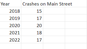

Not terrible, but here it is with a few tweaks.

Which is easier to read?
I made just four tweaks for this:
- I labelled the data directly so that the reader’s eyes don’t have to go back and forth to the y-axis to determine exact numbers.
- With data labelled, I can also delete the y-axis data labels, but I do add an axis title that says what exactly the numbers represent.
- Without y-axis labels, I don’t need gridlines.
- I changed the chart title to something that summarizes the point I’m trying to make.
Present it Well
Nobody buys a cupcake without frosting.

The less technical your audience, the more important it is to make your final product visually appealing. We’ve all been spoiled in the age of “graphic awesomeness” (as I once heard a focus group participant call it), and something that is laden with text and formulas will often deter people who never quite loved math.
If you don’t have a graphic design department at your disposal, here are a few tools that can help you fake it. They are like fondant but less gross. If you are creating a slide deck, I am partial to the slide templates available at SlidesGo, and Google Slides has some good ones as well. They offer a wider variety of slide types within each theme compared to the built-in Power Point templates, which feel a little stale. Then incorporate good visuals. I am a huge fan of the free vector art available at Storyset – pick a visual theme and a color scheme that matches your slide templates and go to town.
Here is a slide I created for my presentation to introduce an example of how my tool applies to practice.

If you’d rather use photos, here are some interesting and diverse sources of stock photos that are free with attribution:
- Can We All Go – Photos all featuring plus-size people in office, home, and swim settings. The collection is limited but growing.
- Nappy: Photos of Black and Brown people in a variety of settings.
- Unsplash: general source of stock photos.
You’ve worked hard on your analysis, and it deserves to be appreciated. Don’t blow it! Take some time to think about how you’ll communicate it, which is just as important as the technical work itself. And when you do, celebrate with a cupcake.
