A cluster analysis suggests: actually a lot of us
How do people feel about autonomous vehicles (self-driving cars), really? Is everyone as vehemently opposed or totally gung ho as they seem? Are you the only one who hasn’t yet made up your mind? With new technologies, like many things, it can be hard to appreciate the nuance and broad range of feelings that people have.
To help answer this question, I analyzed data from the Puget Sound Regional Council’s Household Travel Survey (2019) about residents’ attitudes toward this impending technological shift. I then used a technique called clustering to identify different types of people based on the answers they gave to survey questions about AVs. Was everyone at one extreme or the other, or would I find nuance?
In this post, I’ll explain how I went about this analysis. As always, this is a summary but my full R code is on my Github.
The Data
My data are comprised of ten questions assessing survey respondents’ interest in and concern about AVs. These include questions like:
- How interested are you in riding in an autonomous taxi, with no driver present?
- How interested are you in riding in an autonomous taxi, with a backup driver present?
- How concerned are you about the equipment and safety of AVs?
- How concerned are you about the performance of AVs in poor weather?
To prep the data, I removed blank values and converted worded answers to a numeric, ordinal scale to make them easier to analyze.
Clustering
With the data prepared, I turned to clustering. Clustering is a mathematical technique that works like this: I feed the computer all the data we have from the survey about AVs. It looks for groups of observations that have more in common with each other than with others, by measuring distances between pairs of points. These would be people who have similar attitudes about AVs. (See a great in-depth explanation on clustering here at Analytics Vidhya).
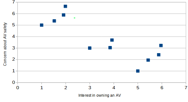
It’s easiest to understand if we start by only considering two survey questions (variables). For example, if the two variables were interest in owning an AV and concern about AV safety, we might expect the data to look something like this:
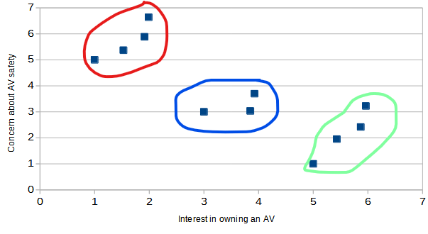
It is easy to visually pick out three clusters from this data, which I do below: people with little interest and a lot of concern (red), people with high interest and not much concern (green), and people who are a little bit of both (blue). And if that approach seems a little loosey-goosey to you, you could take a more scientific approach by measuring how close together the points are in one cluster and how far they are from points in other clusters to convince yourself that these clusters make sense.
Now when you add a third, fourth, or fifth variable, it’s harder to visualize on a graph like this in just two dimensions. Even so, using the clustering technique we can identify some clusters of respondents that belong together, because the math still works.
Here’s a snippet of how I implemented the clustering technique in R, if you’re so inclined:
Results and Conclusion
I told the clustering algorithm to find the four clusters of people that had the most in common with each other in terms of attitudes about AVs. I looked at the characteristics of each cluster it came up with and came up with nicknames for each group. Below is what I dubbed each group, along with the share of respondents the cluster comprises*:
- Alarmed (47%): Not interested in using AVs, and very concerned.
- Enthusiastic (5%): Very interested in using AVs, and not very concerned.
- Cautious (43%): Somewhat interested and somewhat concerned.
- Apathetic (4%): Not interested but also not very concerned.
In this example, we used clustering to help us make sense of a lot of data related to a similar topic, and identify patterns. This might be useful if we were a planning department or advocacy group wanting to adapt our messaging about AVs to different groups of citizens – do we appeal to their excitement or try to ease their fears? It could also just help us understand how many people feel a certain way and how liberally we should allow autonomous car testing in our city.
It is fairly surprising that even in a very tech-heavy and progressive region, with a survey that actually oversamples the regional tech hubs of Seattle and Redmond, we still see quite a bit of concern and skepticism about AVs. It would be interesting to repeat this analysis with data from another part of the country.
In an upcoming post I’ll look at other applications of clustering, including as a way to predict which category something belongs in.
