Since transportation is so intertwined with other aspects of urban life – housing, land use, and technology, for example – it is only fitting that we should look beyond purely transportation agencies for useful data. Enter the Location Affordability Index, a dataset developed by the Department of Housing and Urban Development (HUD) that combines transportation and housing costs to show a more holistic picture of the cost of living across the United States.

People may live further from their jobs to shave some dollars off their mortgages, but do not factor in the increased commuting costs they will incur as a result. Or they may choose to live somewhere with better public transit access but wonder if the higher rent justifies the lower gas bill. For transportation professionals, it can be useful to understand on a region-wide scale how housing and transportation costs interact because our projects may raise or lower some of those costs and may affect different populations differently.
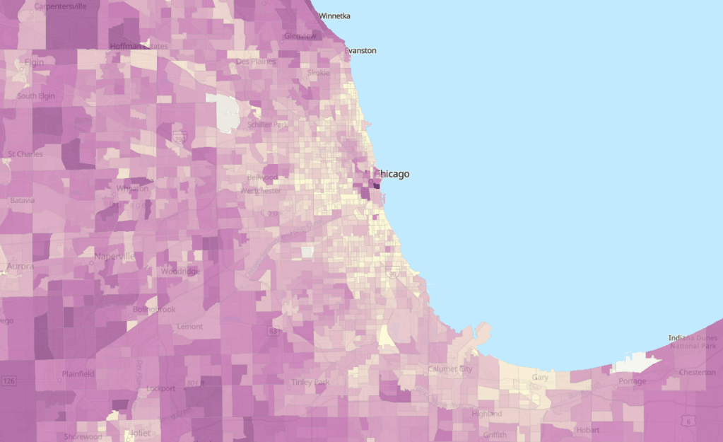
There are a few ways to interact with this dataset. To instantly visualize it for your city, this online ArcGIS map plots it at the census tract level. Here is that map for Chicago:

The results are striking, with many of the most dense urban areas with high housing costs ranking lowest in the LAI (shown in lighter shades). This partly because it takes into account the average wages in that area, which tend to be higher in more expensive cities. And, again, it also factors in transportation costs, which benefit from public transit access and lower rates of vehicle ownership common in denser areas.
However, the overview map misses some of the nuance that makes this dataset stand out. For one, HUD analyzed not just median costs but created eight family type profiles for households of different incomes and family sizes and evaluated how costs varied for each family type in each census tract. It makes it clear that transportation investments, higher wages, and housing availability do not benefit everybody equally, which planners are wise to keep at front of mind. This Story Map, a scroll-through narrative, provides more context on how the LAI was developed and allows for side-by-side comparisons of cities, neighborhoods, and family types, as shown here for Atlanta.

Lastly, the raw data itself is available on HUD’s eGIS Storefront. If housing and land use are up your alley, you’ll find lots more on this site to peak your interest.
I appreciate the obvious care and thought that went into developing this very detailed and nuanced dataset, and hope it can contribute to a greater awareness of how housing and transportation affect each other.