Finding reliable, robust, and interesting data is the first step to any data analysis project, so I thought I’d spent a few posts highlighting some of my favorite data sources out there. One tool I find very underrated in the transportation planning world is the US Census Bureau Center for Economic Studies’ Longitudinal Employer-Household Dynamics (LEHD) data and its visualization tool, OntheMap. It is best used for studying where people who live in a place are commuting to, or where people who commute to a place are living. Say you want to know where people in your city or neighborhood are commuting to, and how you can improve transportation options for them. You can load a custom geography of your city into the tool (using a shapefile, GPS coordinates, or a polygon drawn in Google MyMaps), make a few selections,
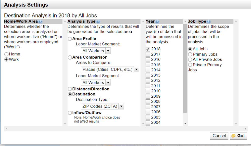
and it quickly spits out a map and list of where people living in your city are commuting to. As in the example below, you can also do the reverse and see where people are commuting from. There are a few options to also filter workers by income, industry, and age.
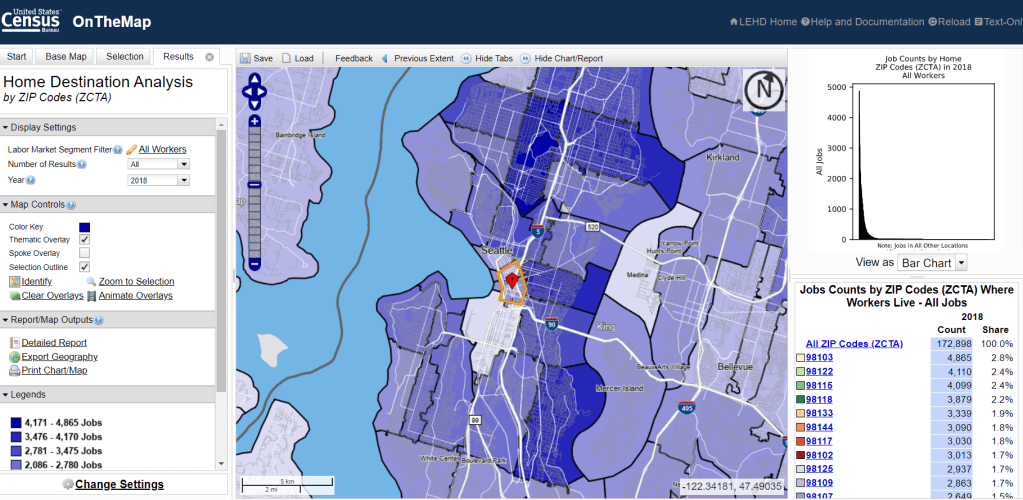
If you’re like me and want more control over how your maps look, you can then export the resulting data into your own GIS software to make it prettier and analyze further.
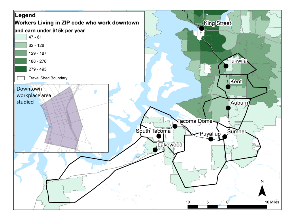
For the analysis shown here, I wanted to look at people who work downtown and earn very low wages (under $15,000 per year). These include restaurant and hotel workers, among others. Where do those people live? It was relevant because my agency’s commuter rail, Sounder, primarily serves people commuting to downtown Seattle, and I wanted to understand how well it is serving people with very low incomes. How many of them live within the areas from which Sounder riders typically commute (outlined in black)? It turns out, not very many. They tend to live in either South Seattle, or east or north of the city, outside the extent of this map. So Sounder won’t help them much, but we run other transportation services from those areas and now we have a better sense of some of those communities’ needs.
Note that In this case I had the tool organize workers’ home locations by ZIP code, but you can choose by census tract or larger areas as well, depending on how granular you want to get. You can also export an Excel file of the data, allowing for endless additional analyses.
If you’ve used this tool, I’d be curious to hear your thoughts as well!
